Handsam Task Progress Chart
Task Performance
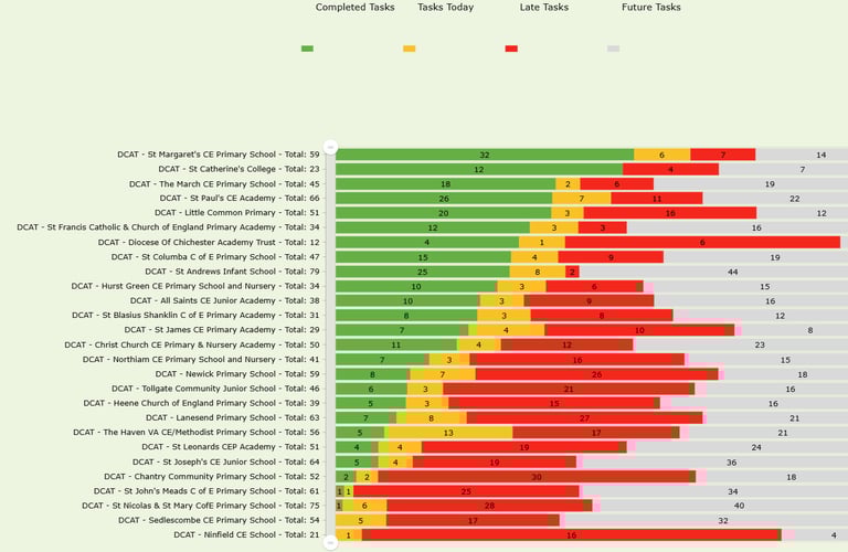
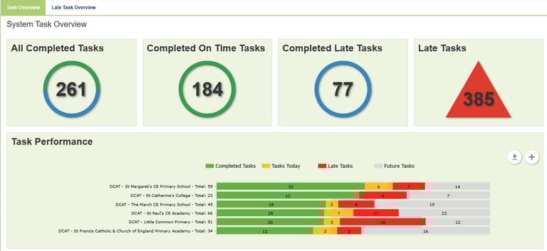
Handsam has introduced a new addition to the Task System Dashboard - Task Performance. It's designed to give a clear, at-a-glance overview of how schools are progressing with their tasks.
The chart displays each school’s task status as a percentage of its total number of tasks. For example, if a school has 100 tasks in total and 50 are complete, 50% of the bar will be shaded green. If 30 tasks are late, 30% of the bar will appear in red, with the remaining portion reflecting other task states as applicable. This visual approach makes it easy to understand both overall progress and where issues may be emerging.
Schools are ranked in descending order based on the percentage of tasks completed, with those performing best appearing at the top and those with lower completion rates shown further down. This creates a league-table style view that allows quick comparison between schools.
By default, the dashboard displays the top six schools in this ranking. Users can click the ‘+’ button to expand the view and see the full table, providing a complete picture of task performance across all schools in the system.
Please contact the client support team for any support you may need:info@handsam.co.uk.
Office 27, East Moons Moat Business Centre
Oxleasow Rd, Redditch B98 0RE
Phone: 0333 207 0737